Shop Email Product · UX / UI Design
Email Performance Dashboard
A simple, straightforward dashboard that lets the end user see how the email product is performing and what effect it has on their total revenue and conversion.
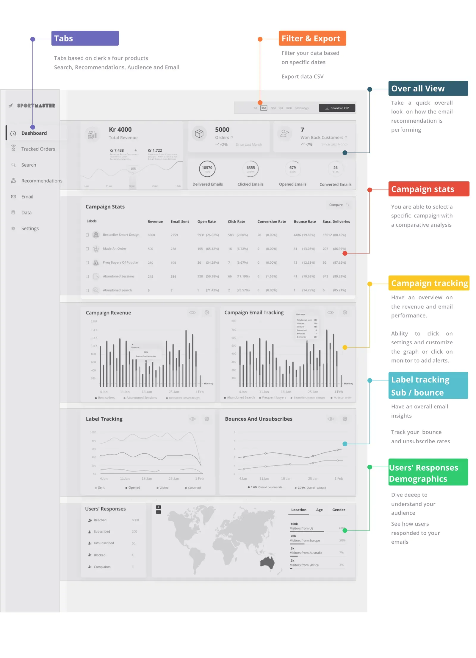
Overview
This dashboard shows the importance of the email product and its performance on campaigns over time. It helps measure engagement growth over time so the team avoids missing out on valuable insights and any significant-change alerts the marketing team should act on. Data is visualised according to a clear diagram, and the most important data is placed at the top left corner of the dashboard.
The problem
Customers and the marketing team lacked a simple, at a glance view of how the email product was performing. They needed to get an overall feel very quickly, yet still dive deep into cost per acquisition and the KPIs that matter, without busy visuals pulling attention away from the data.
Project goals
A simple view of performance
Give customers an easy and simple view of how their Shop Email Product is performing.
Operational KPIs for marketing
Provide important operational information and key performance indicators for the marketing team on cost per acquisition.
Clean, focused layout
A clean layout with simple visuals, graphs and charts, not busy colours, to avoid distracting the user from the data.
An overall feel, fast
Let the user get an overall feeling very quickly.
Depth on demand
Let the user dive deep into the details when needed.
UX process
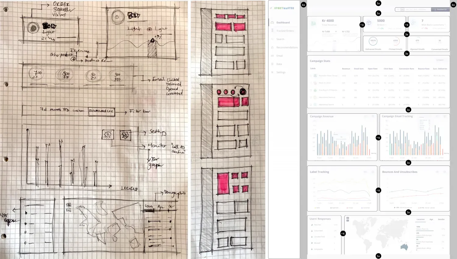
Prioritising what to show first, based on the persona findings.
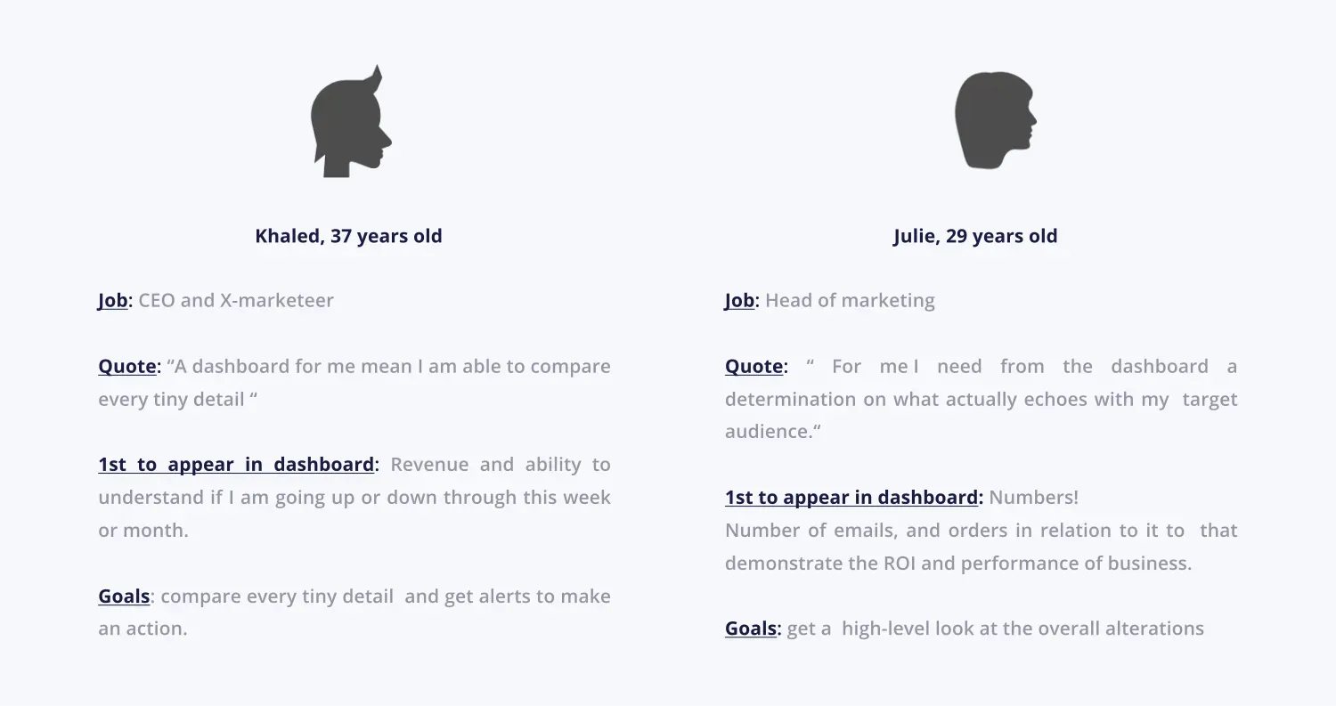
Defining user personas
I conducted phone interviews with two personas. Each interview took roughly 30 to 35 minutes, which helped me understand users' needs, experiences, behaviours and goals, and identify closely with the target user I was designing for.
Lead with the most important data in the top left corner, where the eye lands first, and visualise everything else according to a clear zoning diagram, so the whole picture reads at a glance.
Key features
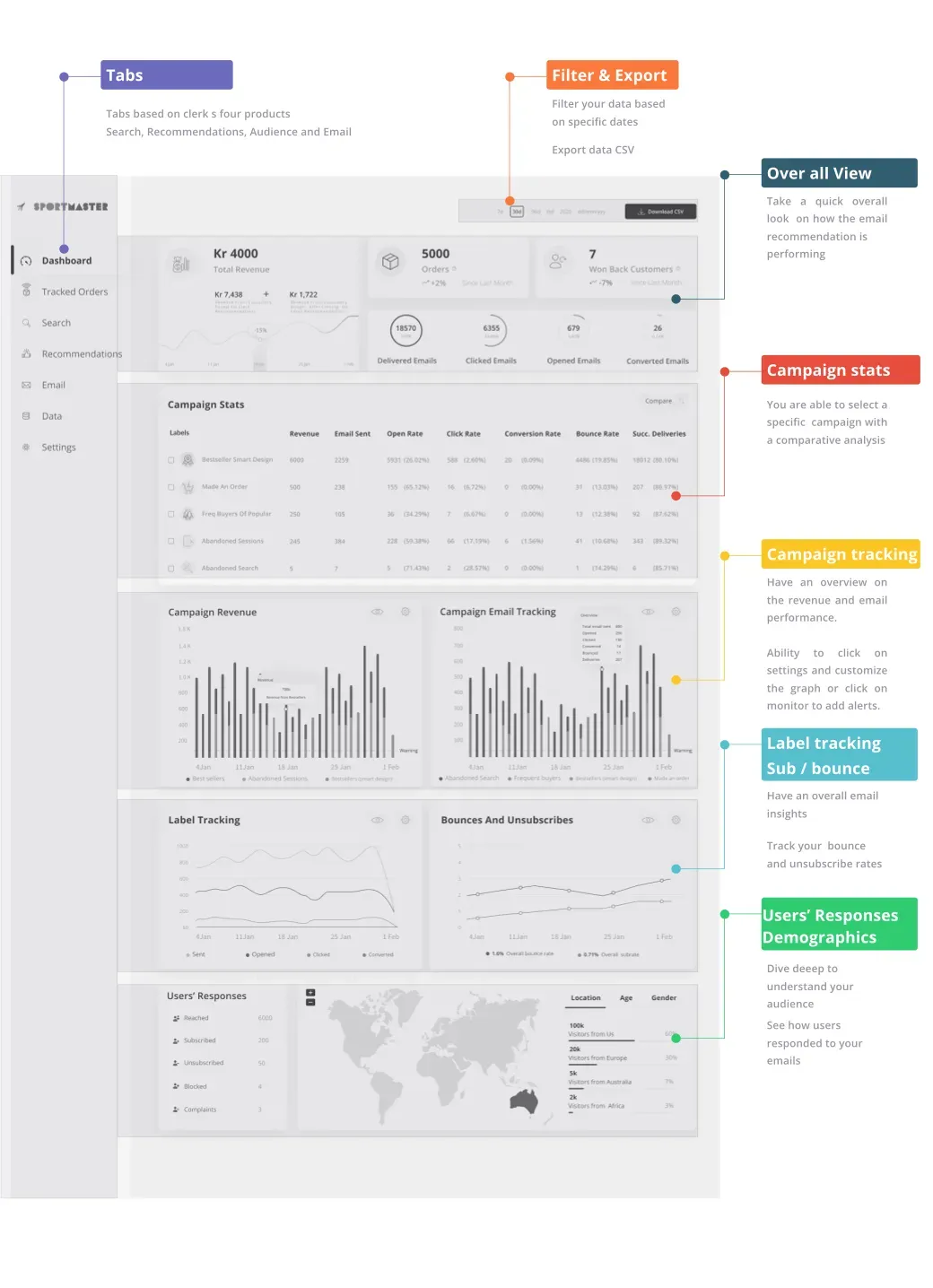
Dashboard zoning
Dividing the dashboard into zones viewers can relate to.
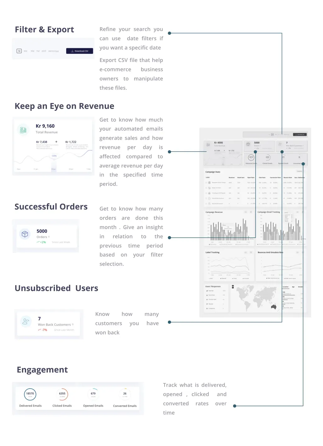
Overall insight
Get a glimpse of how your business is going, quickly.
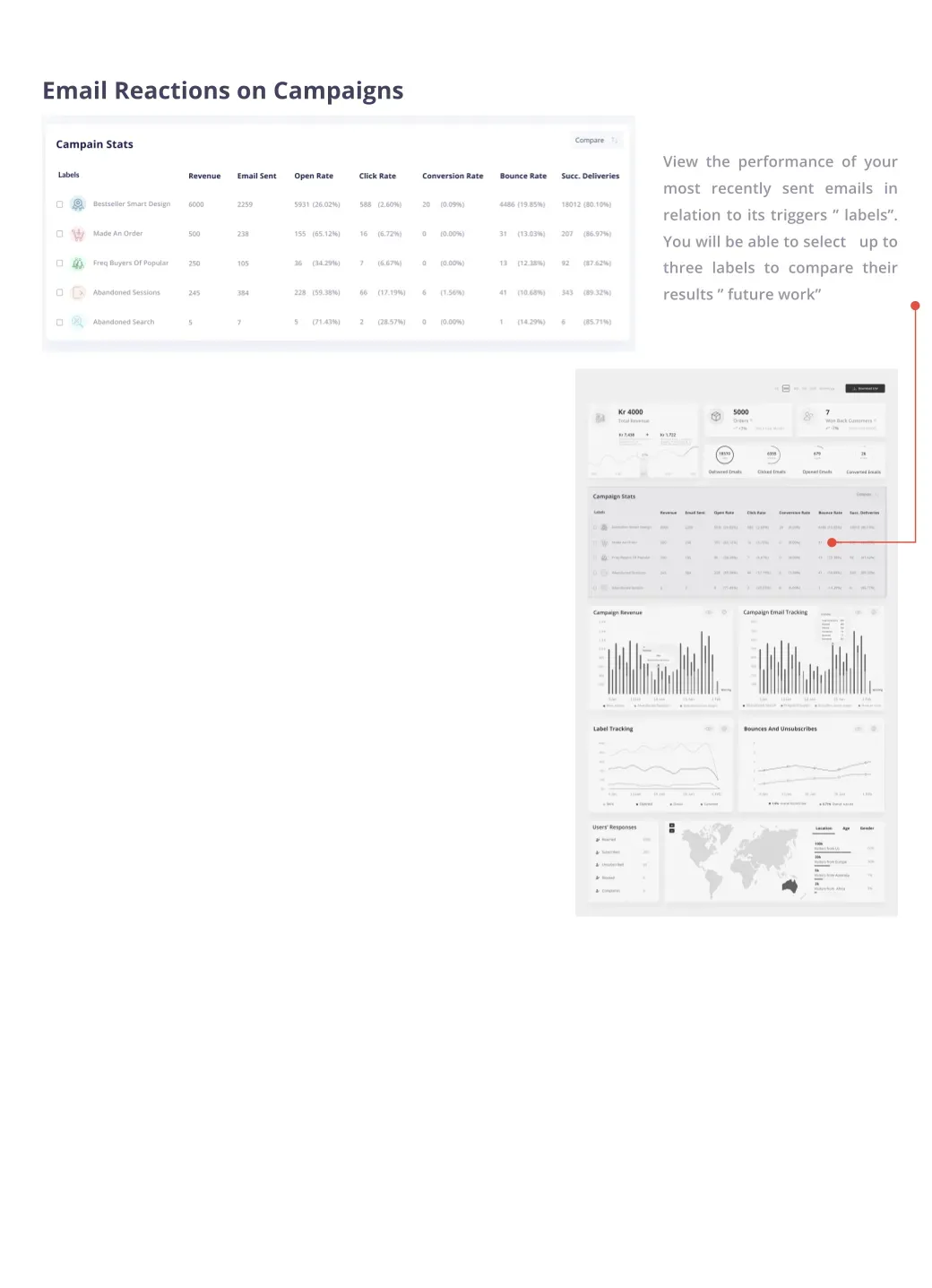
Campaign stats
Get a glimpse of each campaign's stats.
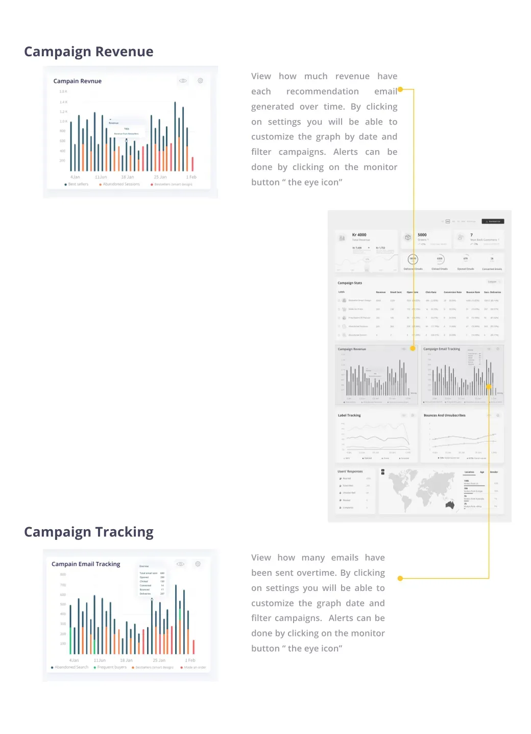
Campaign tracking
Insights into how the campaign is performing.
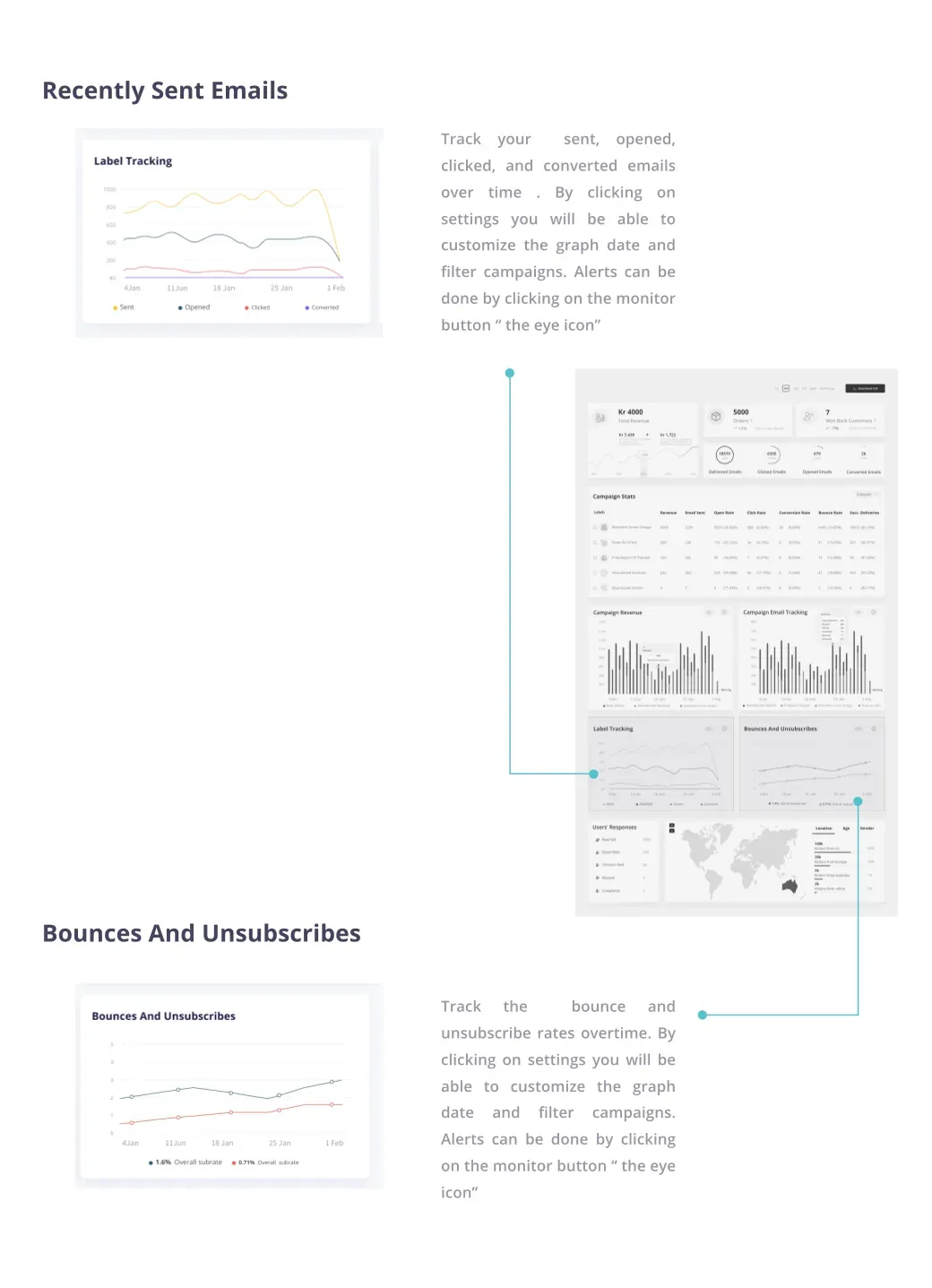
Label tracking · Sub vs Bounce
Track users' reaction to a campaign.
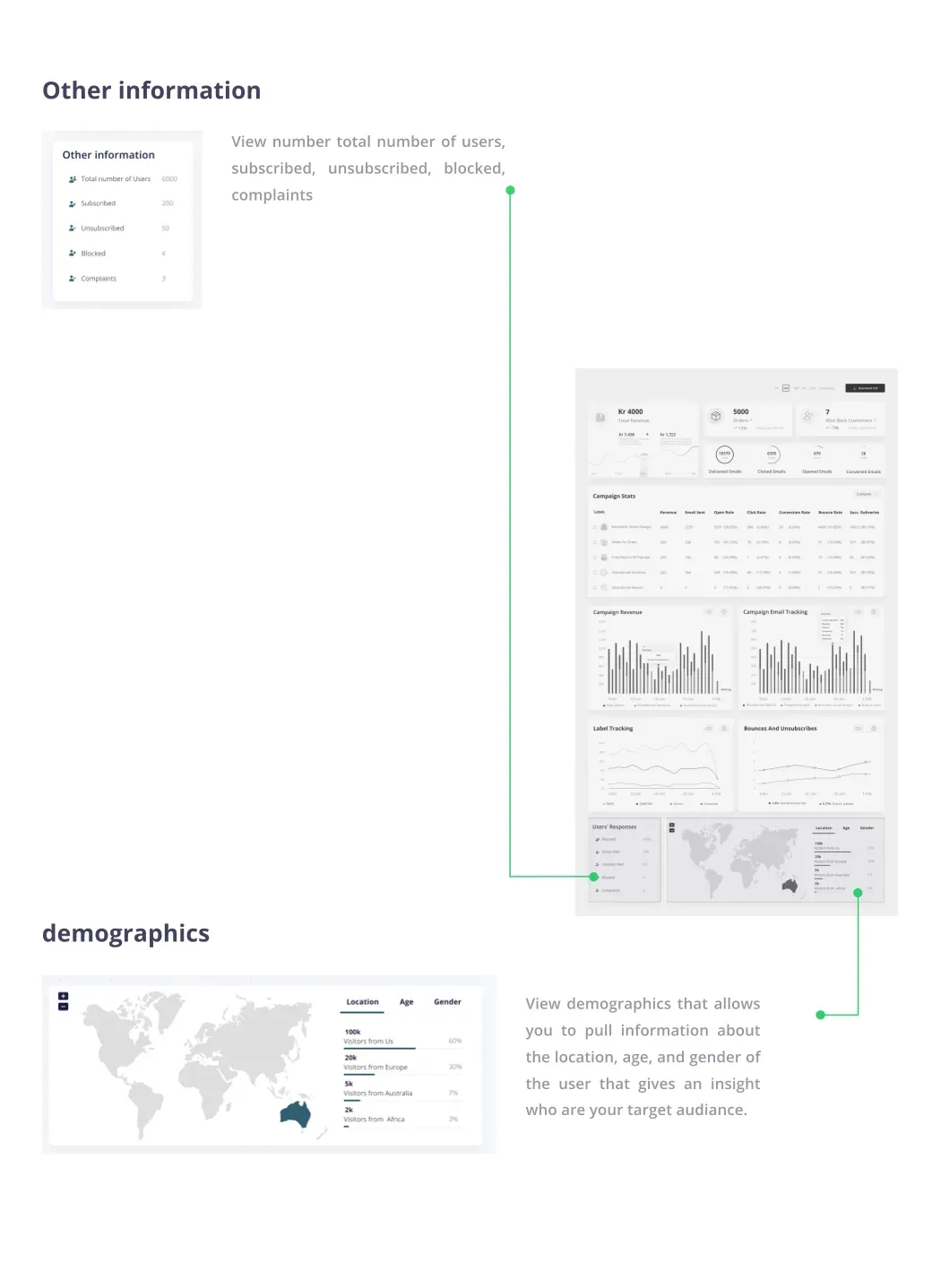
Responses & demographics
Understand who and where your users are.
In motion
Outcome

The dashboard organises email performance into clear zones, leading with the most important metrics top left, so the marketing team can read the overall picture at a glance and drill into campaign, label and demographic detail when they need it.