SOUNDBOKS, Denmark · Senior UX Design Lead · 2024
Lightboks
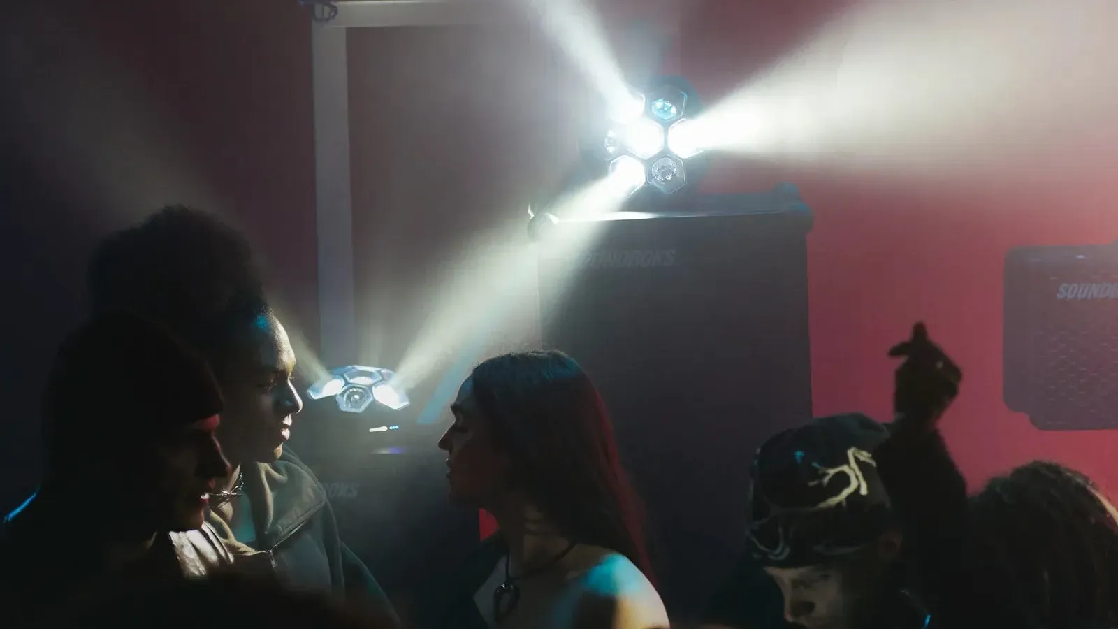
The end to end UX for Lightboks, SOUNDBOKS's first light. A portable party light that reacts to your music, taken from concept and research through to the shipped companion app.
Overview
Lightboks is SOUNDBOKS's first light, a portable party light that reacts to your music. The team led the UX end to end: from the earliest product definition and research, through the colour and control systems, to the companion app that shipped. We owned the process and drove it across teams, working with the product manager, the light team and engineering, and took Lightboks from a concept and a brand new product category all the way to a validated, launched product.
The problem
SOUNDBOKS was moving into an entirely new category. The challenge was twofold: bring a brand new product type into an app built for speakers, and define a light control experience that felt effortless at a party yet powerful enough to personalise, all while feeling unmistakably SOUNDBOKS. Get it wrong and a light meant to set the mood becomes one more thing to fiddle with in the dark.
Project goals
Bring a new category into the app
Integrate Lightboks into the existing SOUNDBOKS app and lay an information architecture that scales beyond speakers.
Make party lighting effortless
Lead with audio reactivity so the light just works, then let people reach for control only when they want it.
Customisation that feels personal
Build colours, energy levels and effects into one predictable system where presets belong to the user and carry across devices.
Validate for real
Reduce risk by testing internally, externally and at real parties before launch.
UX process
What testing surfaced
The team ran research at every stage: competitive analysis, personas and two rounds of app usability testing, then external testing with recruited SOUNDBOKS owners and tests at real parties. The signal was consistent. Audio reactivity was the hero; when people saw the light move to the music it felt like a real party and they stopped fiddling. Custom colours and memorable palette names delighted. Battery life was a real anxiety, with people dimming the light unnecessarily because they could not tell how much charge was left. And testers valued that Lightboks looked and behaved like the SOUNDBOKS they already trusted.
Design for effortless first, control second. Lead with audio reactivity so the light just works out of the box, then layer user owned, predictable customisation on top: colours, energy levels and effects. And make the colour palettes abstract and universal rather than themed, so they read the same for everyone instead of leaning on culturally specific ideas.
Key features
Device card
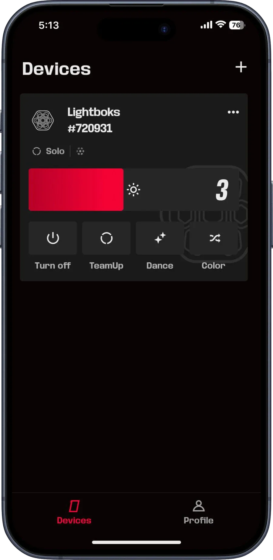
A single home for every Lightboks. Colour, energy level and brightness at a glance, with battery and firmware surfaced where people actually look.
Palette creator
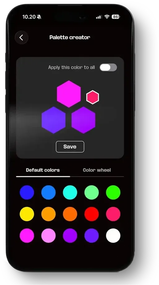
Build a colour from a wheel, a hex code or the swatch library, then save it. Presets belong to you and follow you across devices.
Colour presets
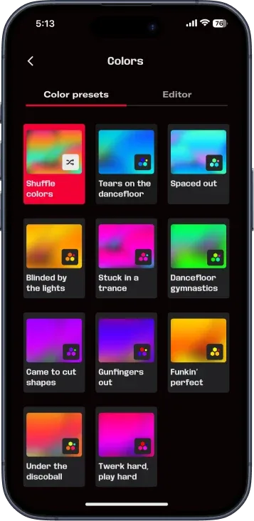
A library of generative, memorable palettes like Spaced out, Blinded by the lights and Gunfingers out, with a shuffle to set the mood in a single tap.
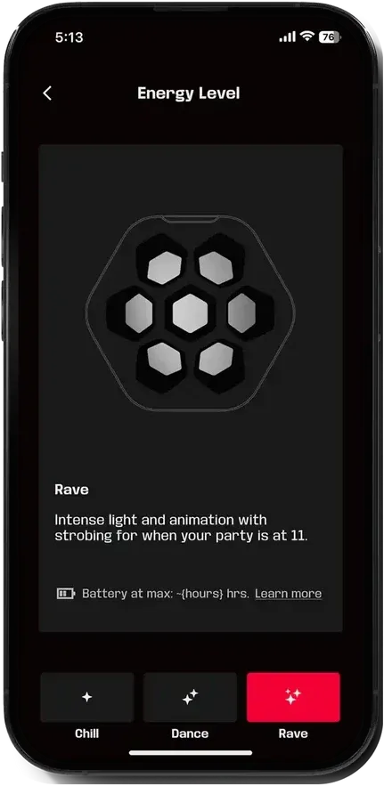
Energy levels
Rave, Dance or Chill. One control that matches the light's intensity to the moment, with the battery life for each mode shown up front.
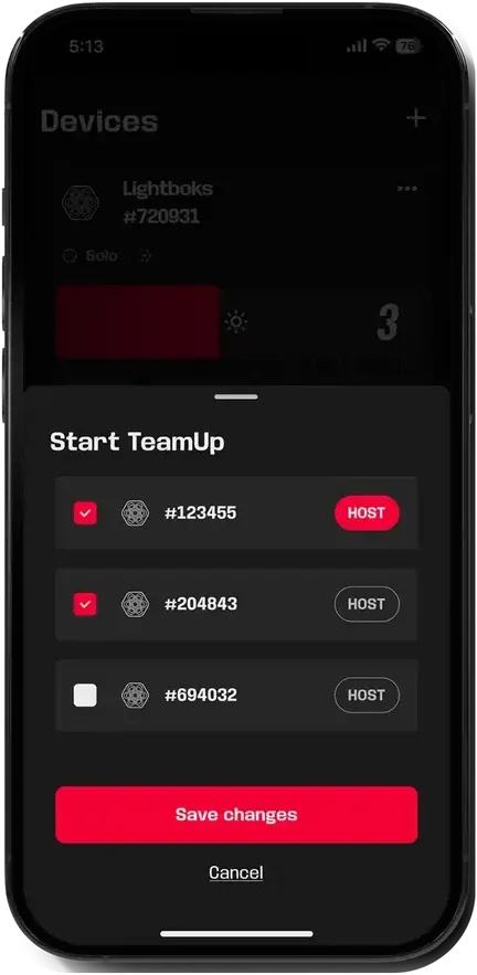
TeamUp
Link unlimited Lightboks up and drown the place in light. Pick a host and sync every unit in a couple of taps.
Gallery
Outcome
Lightboks shipped as SOUNDBOKS's first light. The companion app the team led, the device card, colour system, energy levels and TeamUp, launched alongside it, validated through internal, external and real party testing. Testing also surfaced the fixes that shaped the final product, from making battery life discoverable to keeping audio reactivity front and centre.
How we ran it
The work ran as a six phase process: Understand, Diverge, Reflect, Wireframe and internal testing, Prototype, and Test, across the product manager, the light team and engineering. That meant framing the product with stakeholder interviews and a value proposition canvas, prioritising the MVP against SOUNDBOKS’s USPs, facilitating Crazy 8s and critique workshops, and running the colour, energy level and effects systems from first sketches to a high fidelity Figma prototype.
Alongside the flows the team owned the content and colour strategy: defining the generative colour palettes with their values and behaviour, and the naming system, and making the call to move away from themed palettes toward abstract, universal ones. Every round of research, from usability sessions to external testing with recruited owners and tests at real parties, fed the next iteration, right up to the launched product.