Memorix, Denmark · UX Design & Frontend development
Memorix
A redesign of Memorix, a digital tool that helps students build personalised, efficient memory journeys, with UX and front end work alongside the team.

Overview
Working with the design and development team, I redesigned Memorix, a digital tool that empowers students to create personalised, efficient memory journeys they can share across their academic community, to make it simpler and improve how students learn.
The problem
University students worldwide struggle with memorising new information, 70% of what they learn is forgotten within the first 24 hours, and they try to counter this with inefficient techniques.
Project goals
Simpler for students
Redesign the current Memorix website to make it simpler for students.
A digital memory tool
Empower students with a digital tool to create personalised, efficient memory journeys they can share across their academic community.
Improve learning
Improve learning capabilities and the user experience of the memory technique.
Mobile & tablet
Introduce mobile and tablet optimisation.
UX process
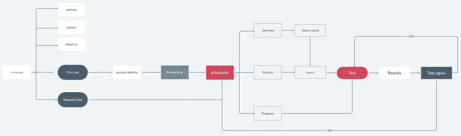
Reviewing the existing app's structure to check the flow before changing anything.
Gathering insights
After collecting the recordings from the user interviews, I conducted affinity mapping with my teammate to synthesise the pains identified, grouping the problems under common themes and features across the platform.

Since this was an existing app with limited room for change, we focused on adding an onboarding flow and tidying minor interactions, rather than restructuring what already worked.
Key features
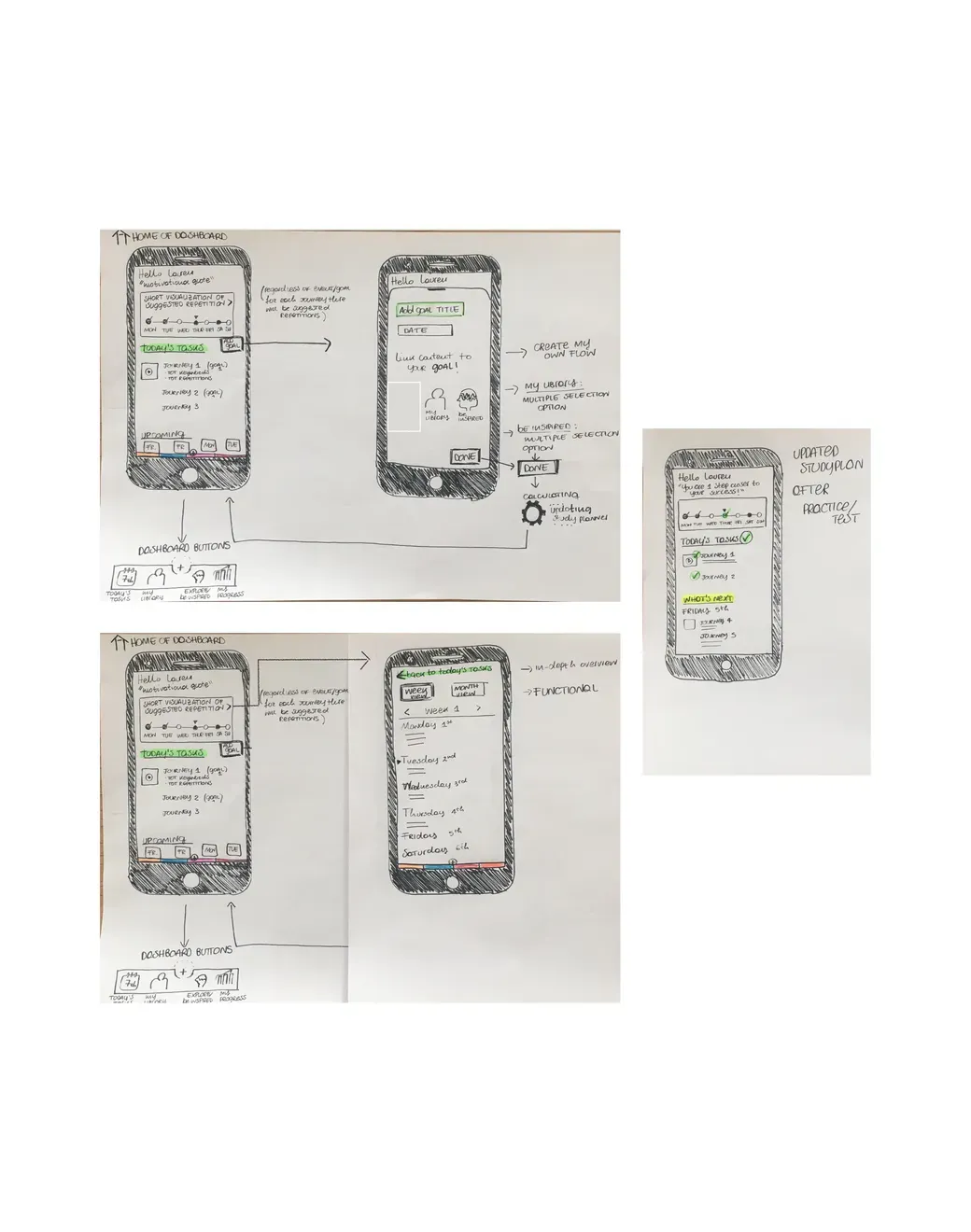
Sketch first
Sketching before wireframing, to try many ideas and iterate toward the best solution.
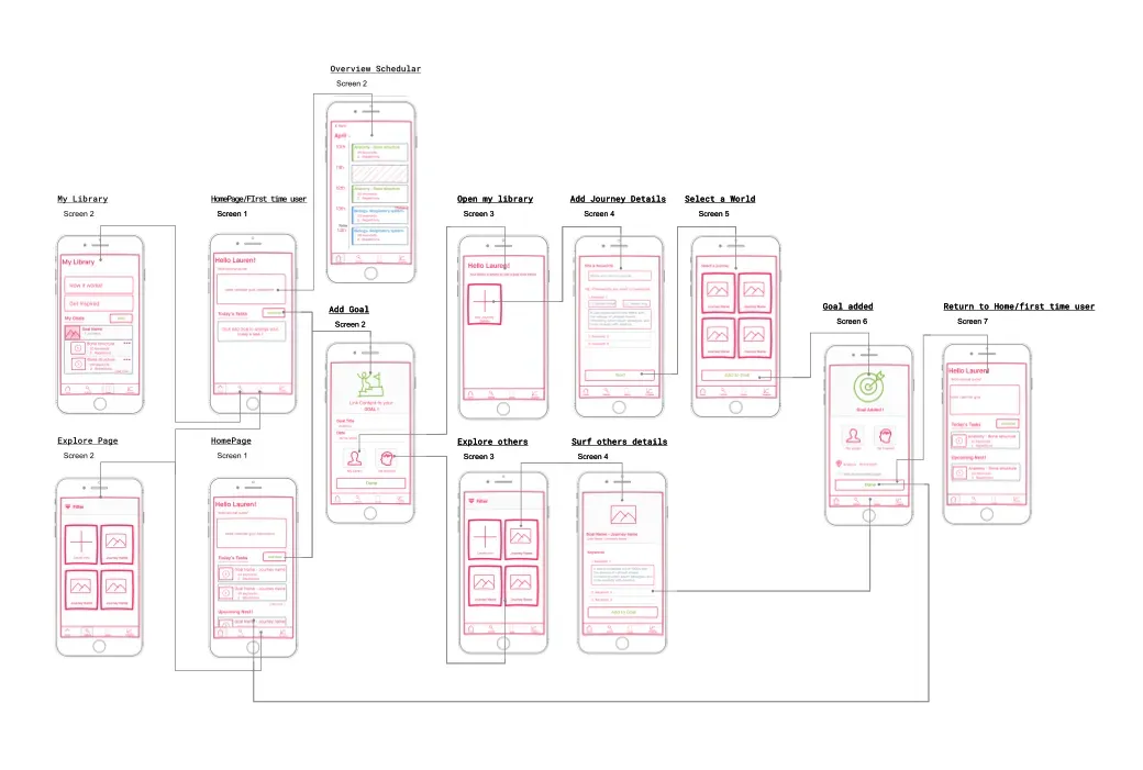
The Scheduler page
Wireframing focused on the Scheduler page, the heart of the app, for space allocation and content prioritisation.
Outcome
Memorix gained an onboarding flow and a clearer Scheduler experience, making the memory technique easier for students to pick up and use.